
Smart Gardener
Color in the Garden
A quick primer for successful combinations
Every gardener is an artist. After all, you “paint” your garden with plants. Just as an artist moves paint from palette to canvas, the gardener’s art lies in creating a colorful arrangement of flowers and foliage that harmonize and complement one another.
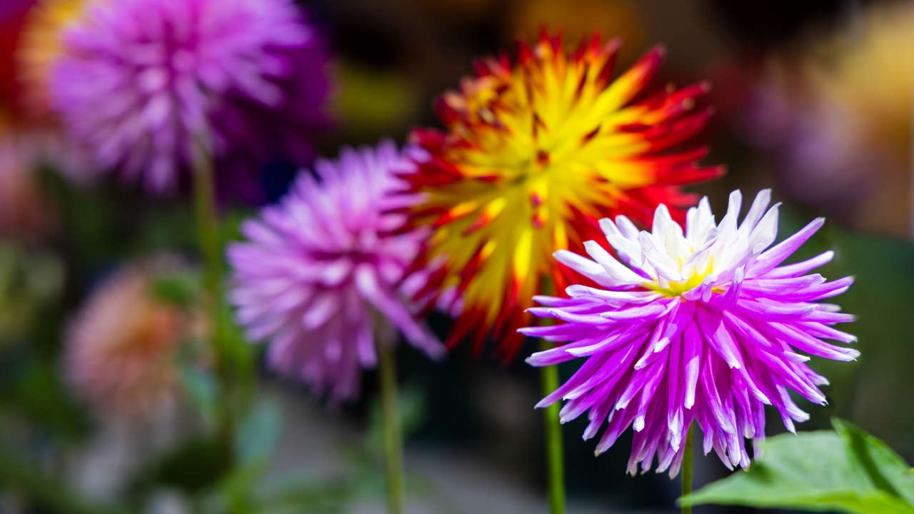
A planting of burgundy-leaved canna lilies, orange zinnias, red-leaved fountain grass, and chartreuse coleus makes for a hot-colored tapestry that feels tropical and exotic. At the other extreme is a grouping of pale blue ageratum, pastel pink roses, and white sweet alyssum, which creates a cool, soothing, classical, English-garden combination.
Gardeners may compose colorful combinations in containers, window boxes, or in beds and borders. Your masterpiece can be as small as a pot filled with vibrant annuals or a “canvas” that is a sprawling suburban lot. Understanding how color combinations work can help you get the most out of your garden, big or small.
Here's to Hue
Most people see a violet afterimage in the white circle. Violet is the complementary color of yellow. Complementary colors are directly opposite one another on the color wheel, such as red and green, orange and blue, and yellow and violet.
When we stare at the yellow circle and then the white circle, our mind’s eye perceives the opposite color. These afterimages occur all the time in our visual perception, but we’re not always aware of them.

Stare at the x in the yellow circle for about 20 seconds.
Then look at the x in the white circle. What do you see?
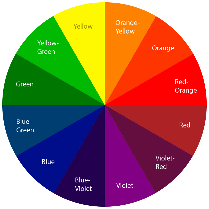
Color wheels are composed of primary colors—red, yellow and blue—and secondary colors—green, orange and violet, as well as hues in between.
Complementary colors
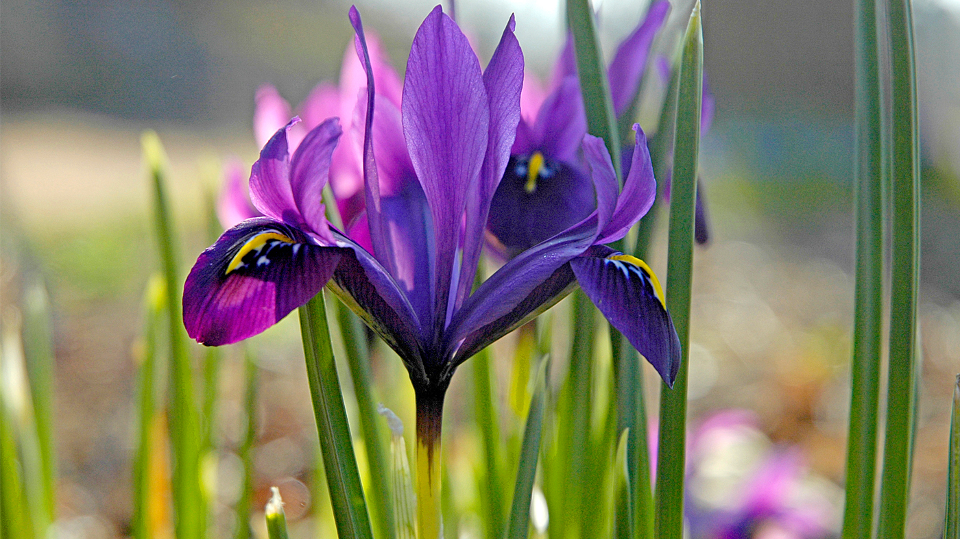
When you pair complementary colors together, they reinforce each other—each color appears more intense than if they stood alone or next to other colors. Think of purple petunias and yellow daisies, blue forget-me-nots with orange tulips, or yellow-flowered yarrow and violet salvia. These pairings become more vibrant and intense than when the plants are grouped alone or with other colors.
The same goes for pairing red and green—especially in the shade. Think of red begonias paired with green hostas or ferns. The red pops out next to green. You can also create eye-catching combinations in shade with chartreuse-leaved hakonechloa grass, orange-flowering tuberous begonias, and blue-leaved hostas.
Harmonious colors
Harmonious colors are those that appear next to one another on the color wheel, such as green and blue, yellow and white, and red and orange. Victorian gardeners were fond of creating one-color borders, such as all-blue or all-white plantings.
Before you focus on your preferred colors, consider the backdrop for your plants—against a fence, the house or garage, in a window box or flowerpot.
The background color can make a difference. A brick or wood wall that’s brown, reddish-brown or orange is a good backdrop for warm-colored flowers and foliage. A taupe, grey, or white background lends itself to shades of white, pink, blue, purple, and lemon-yellow.
Nina Koziol is a garden writer and horticulturist who lives and gardens in Palos Park, Illinois.